TATOÏ Club | Visual Identity – Packaging / Stationery
The Context
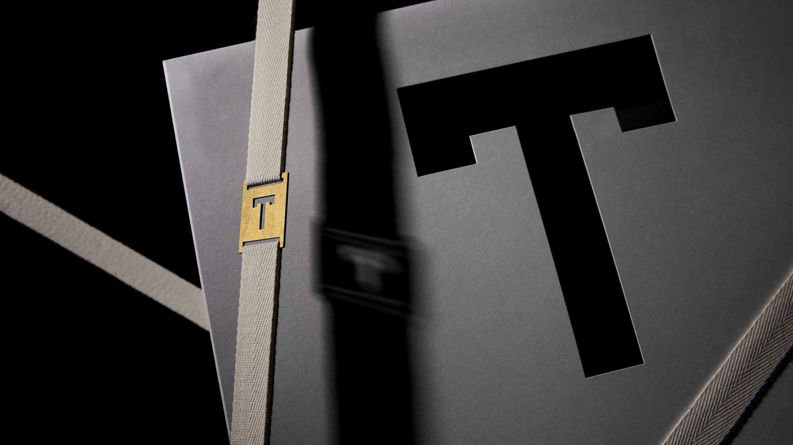
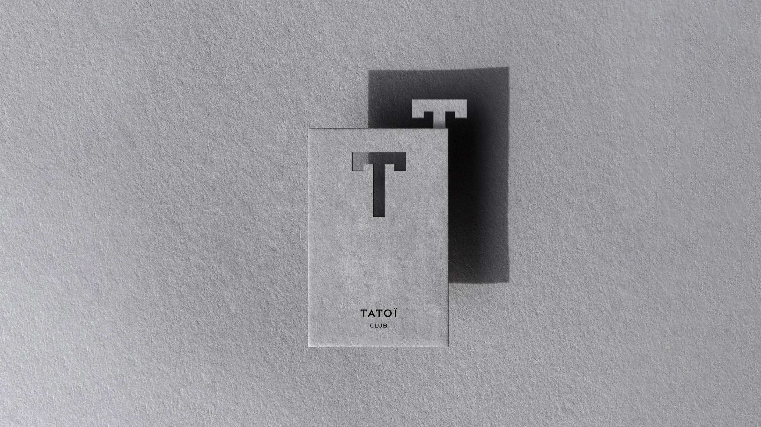
Embracing a bold new aesthetic, TATOÏ Club’s visual identity evolves with a refined elegance inspired by the iconic capital “T” logo.
THE CONCEPT
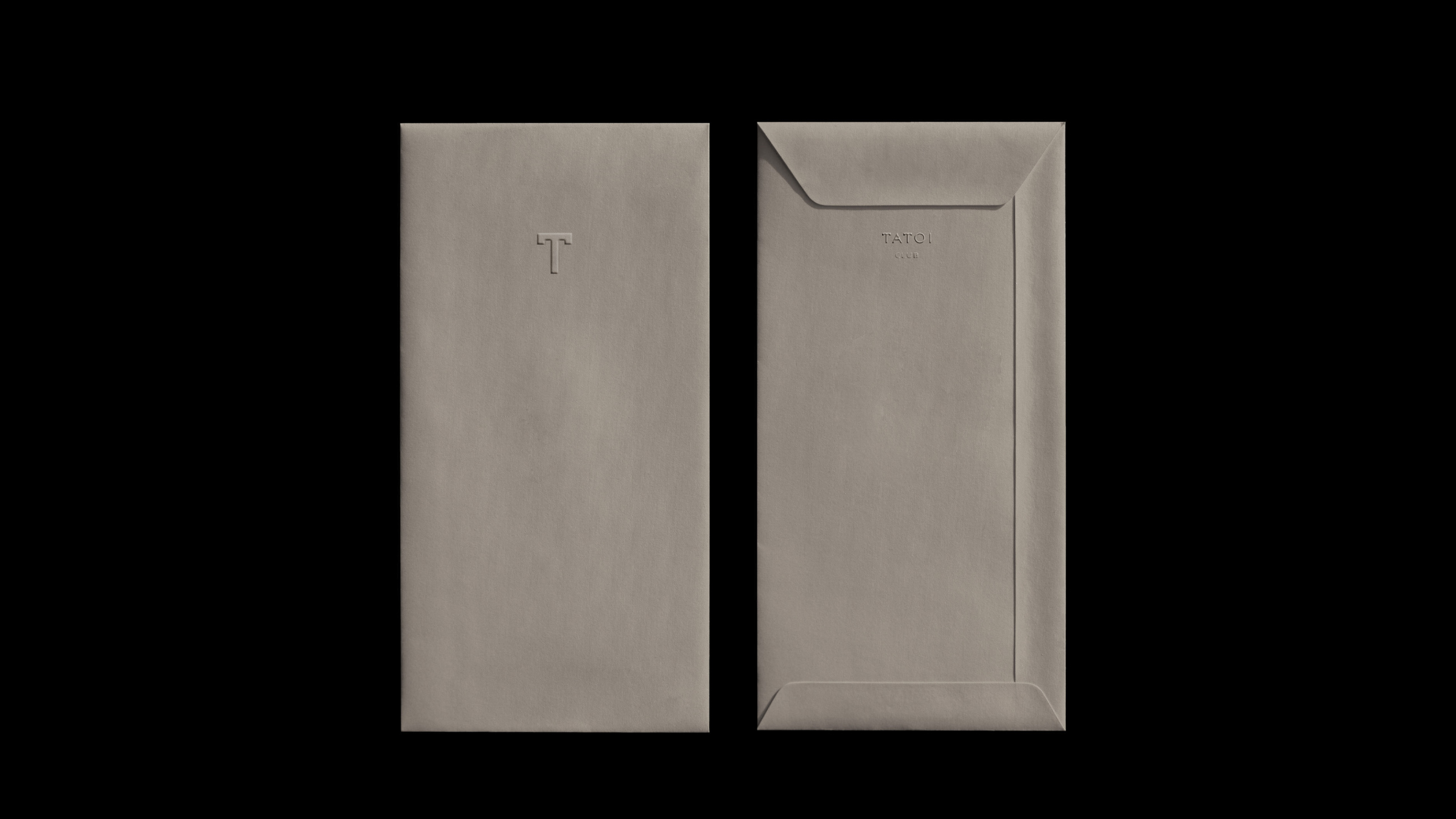
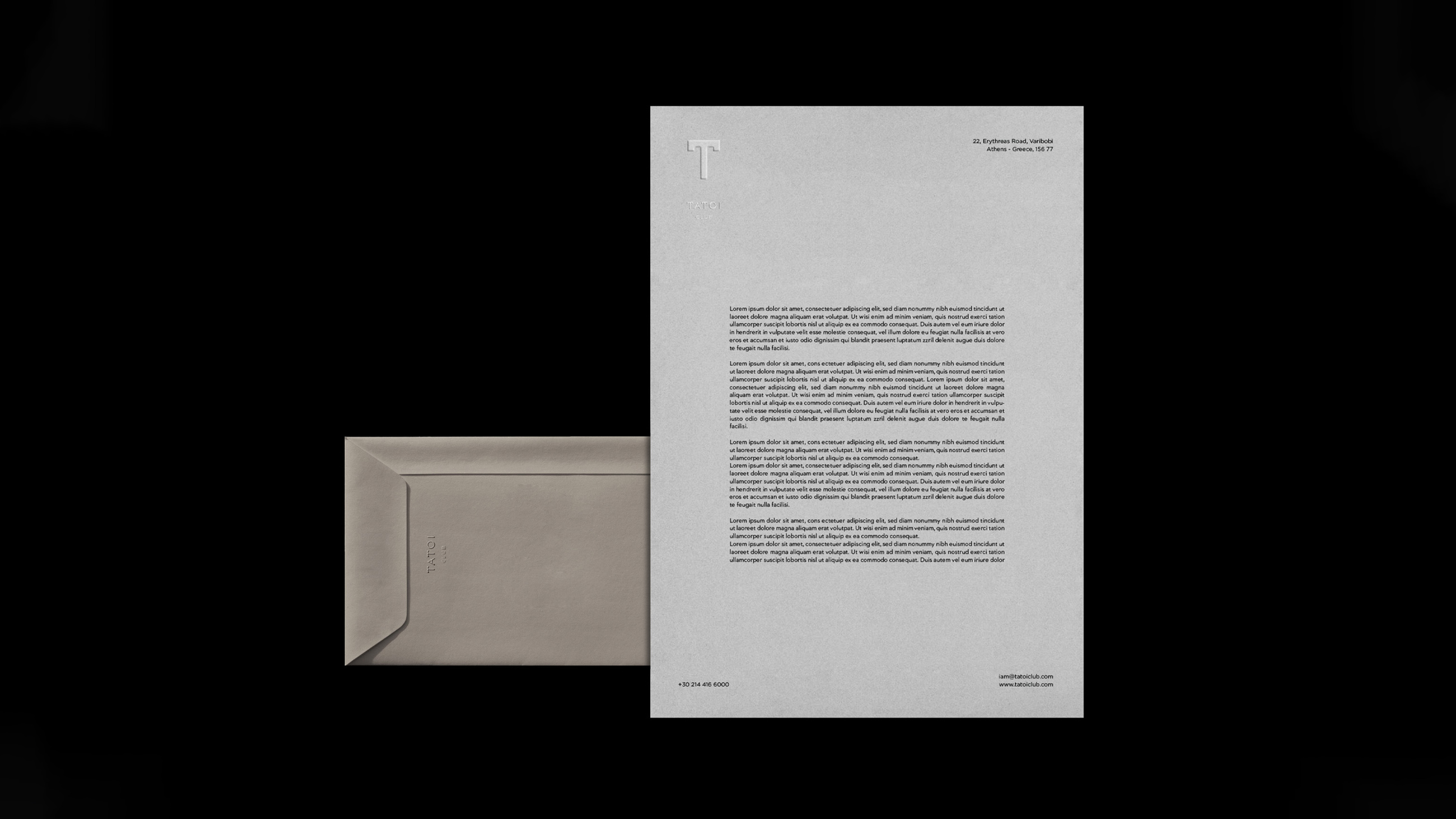
The color palette of subtle gray shades, accented with a touch of gold texture, embodies timeless luxury and modernity. The harmonious blend of these hues reflects the commitment to excellence and style, seamlessly integrating tradition with contemporary design. The visual evolution enhances the brand’s presence and deepens the connection with members who value both heritage and ingenuity. The store’s packaging features the iconic “T” logo, ensuring brand recognition and a touch of elegance with every purchase.






PHOTOGRAPHY: APOSTOLIS KOUKOUSAS | STUDIO 46
PRINTED BY TYPOGRAFIO PLETSAS – KARDARI
