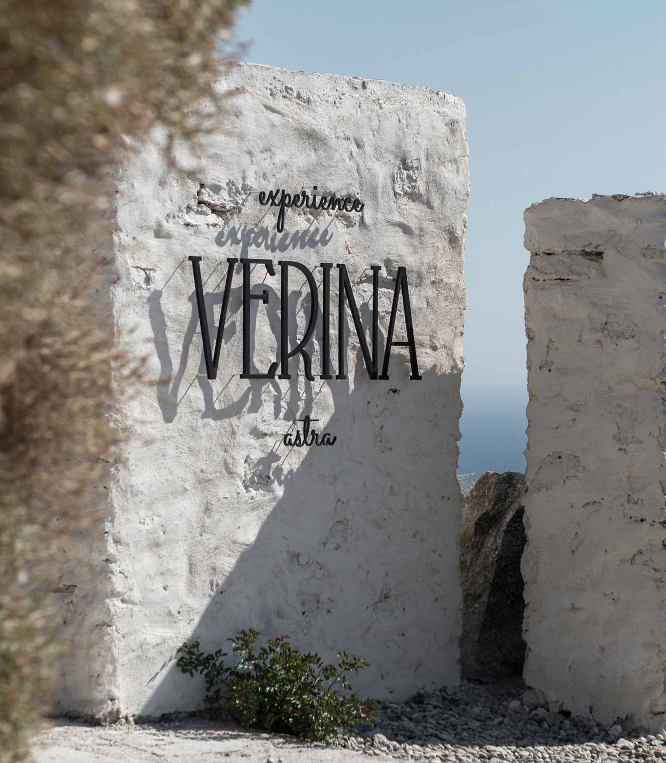
Virtù Suites Naxos Brand Identity
THE CONTEXT
Touching the soul and feeding the imagination. Because some places simply take one’s breath away.
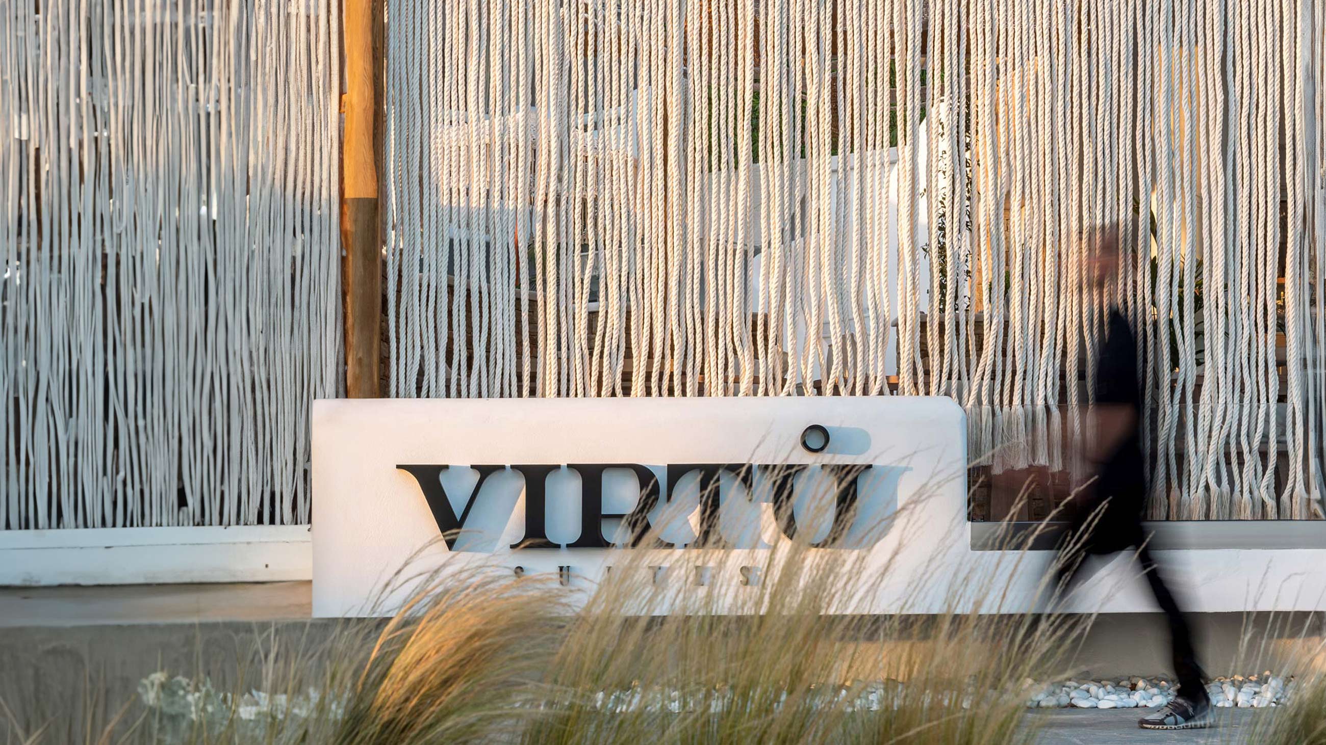

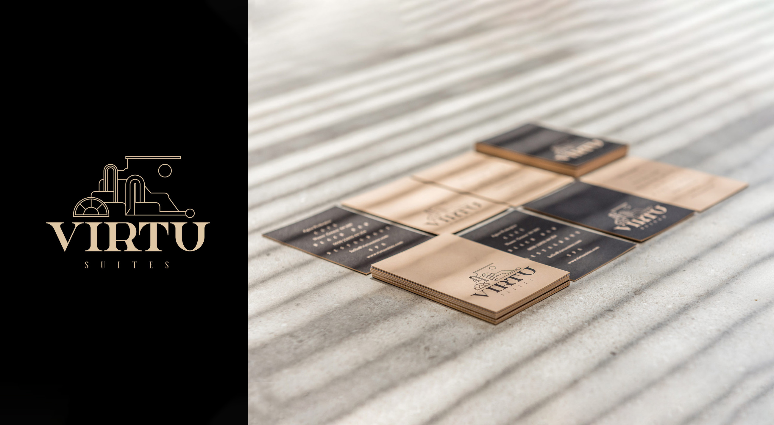
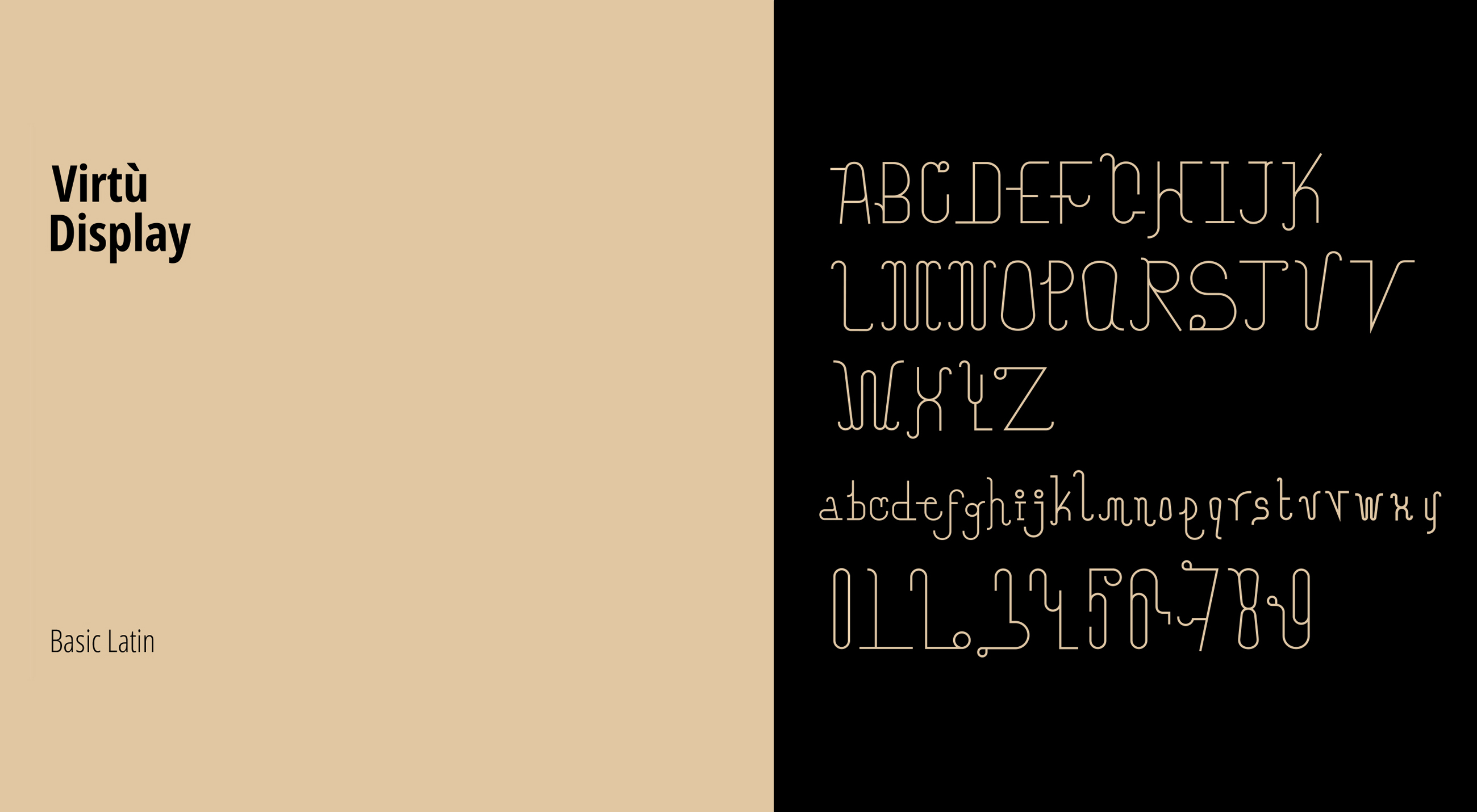
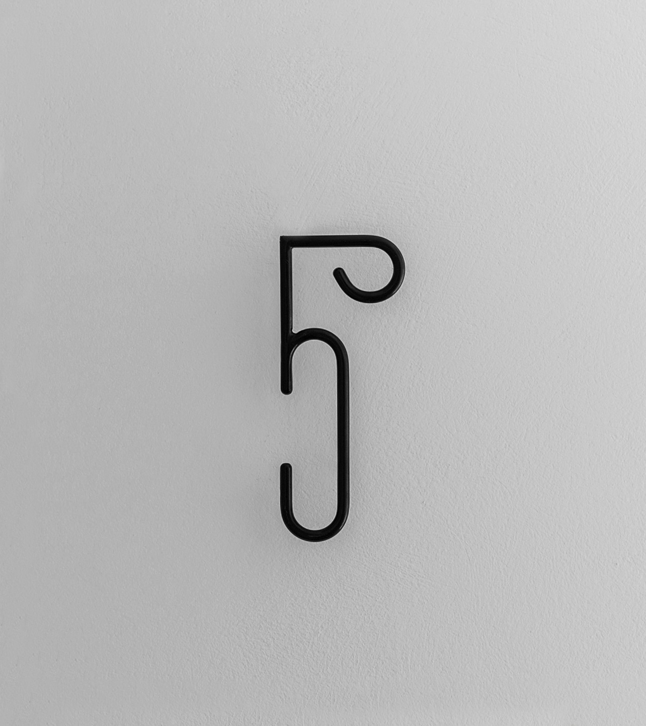
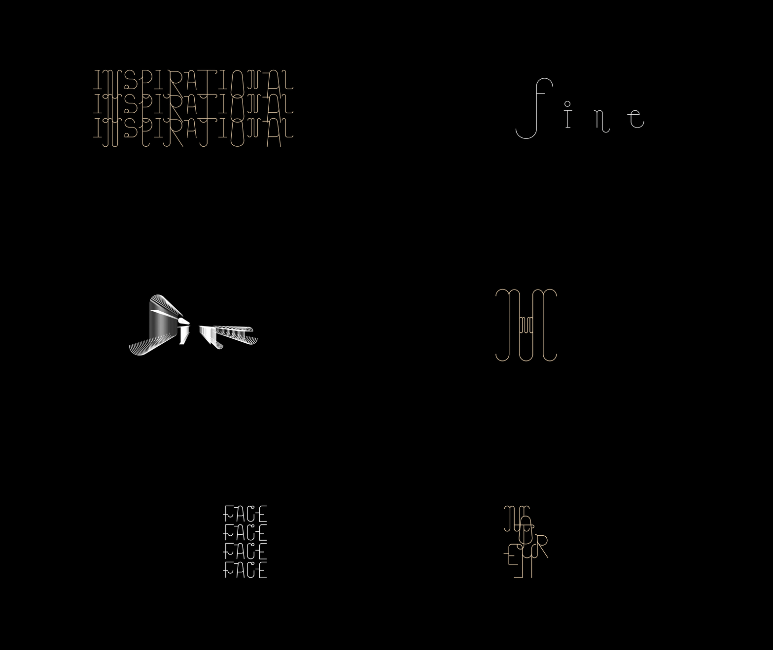
Virtù Suites is one of those places, where indelible, unique & treasured moments may be discovered. To celebrate its uniqueness we started by creating a custom font, truly inspired by the Italian late Baroque architecture and its luxury hint. A custom typeface —with letters & numbers— is always made exactly to specific brands. And more specifically, a serif font that promotes feelings of class and heritage, making them ideal when a brand wants to be felt like an “established” one. Cycladic-inspired doors, skylights, and windows are transformed in the ascender and the descender of each letter.
THE CONCEPT
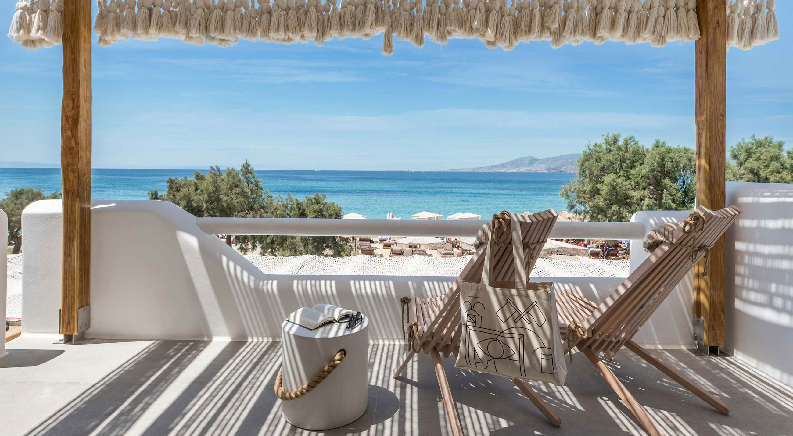
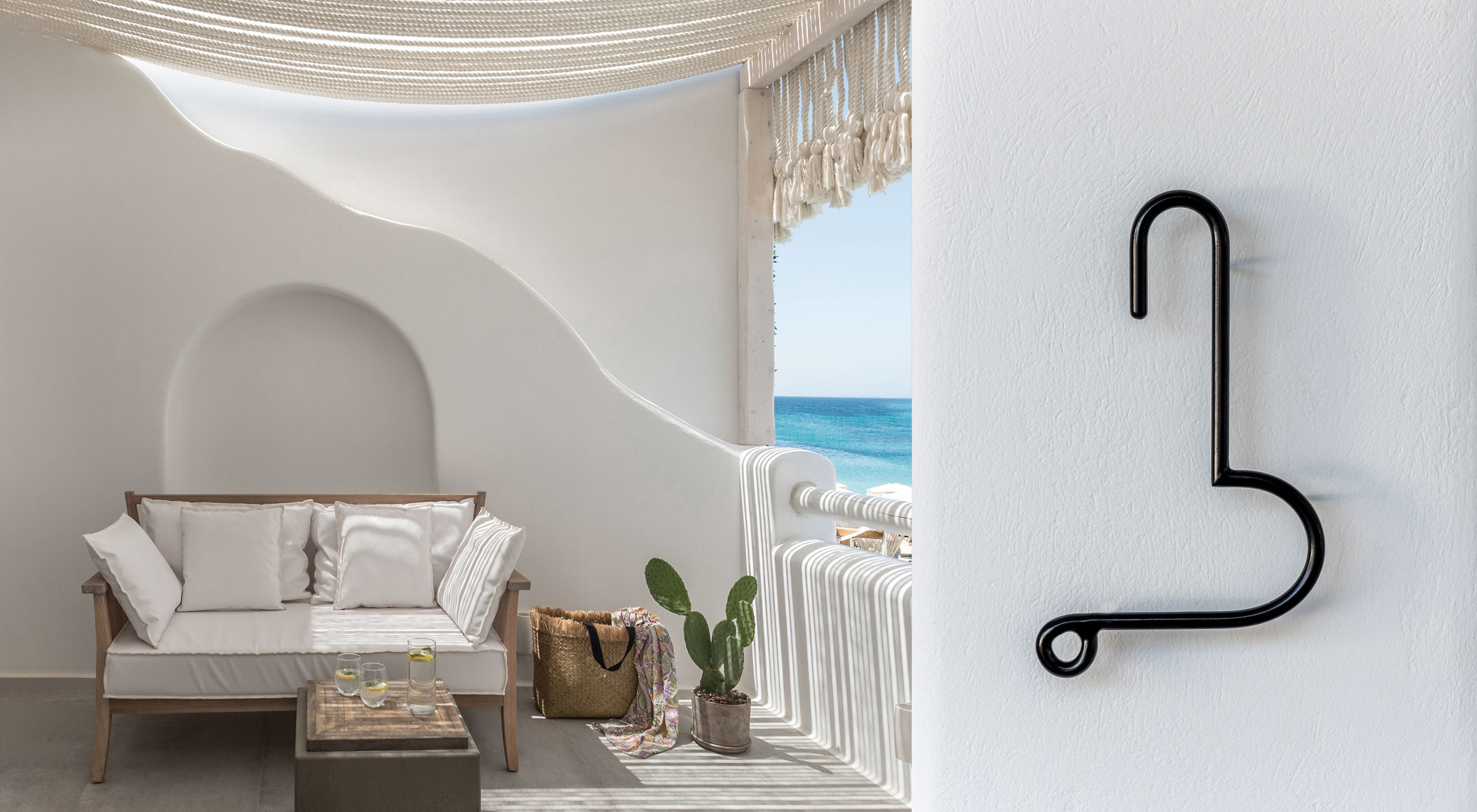
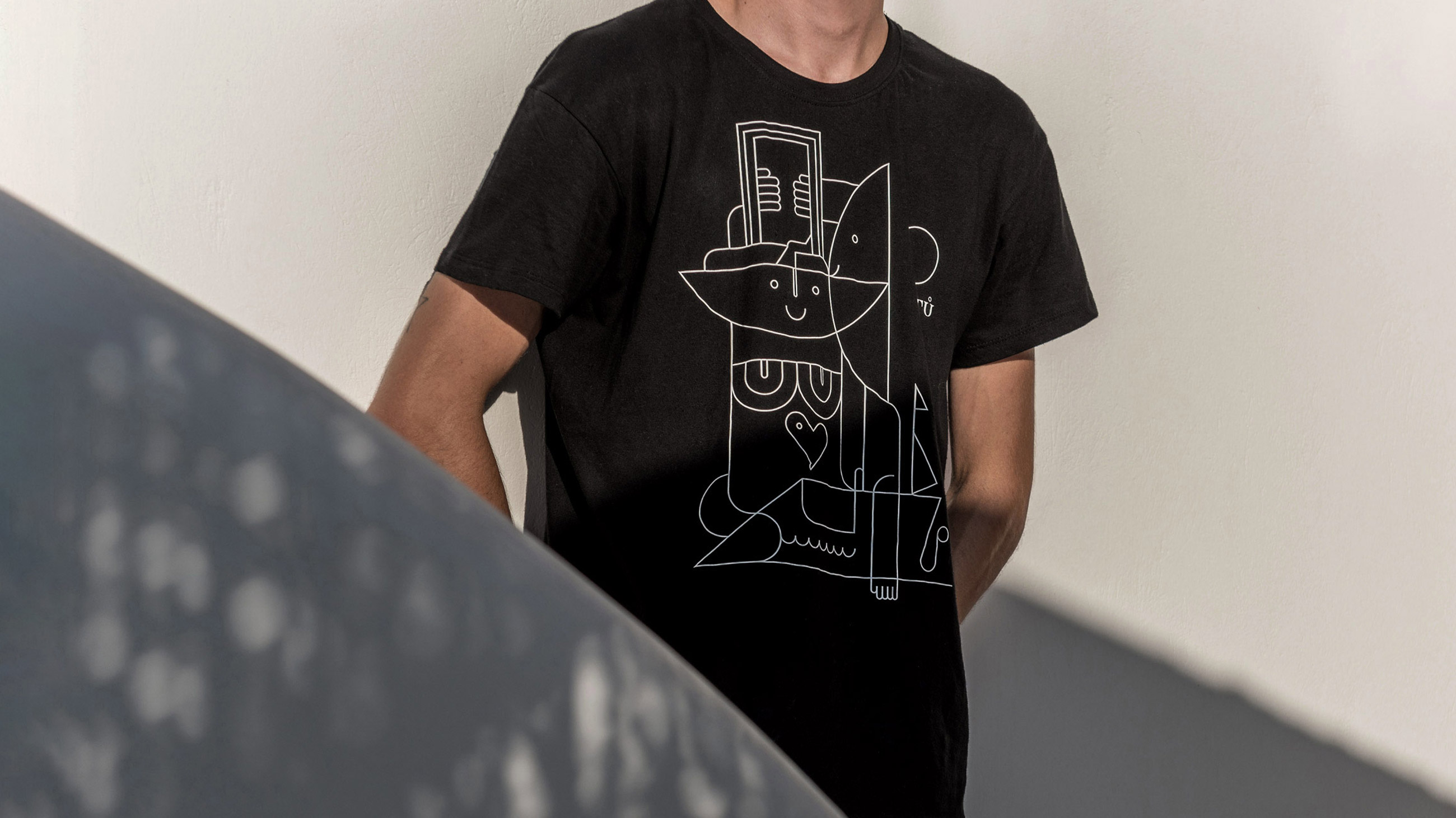
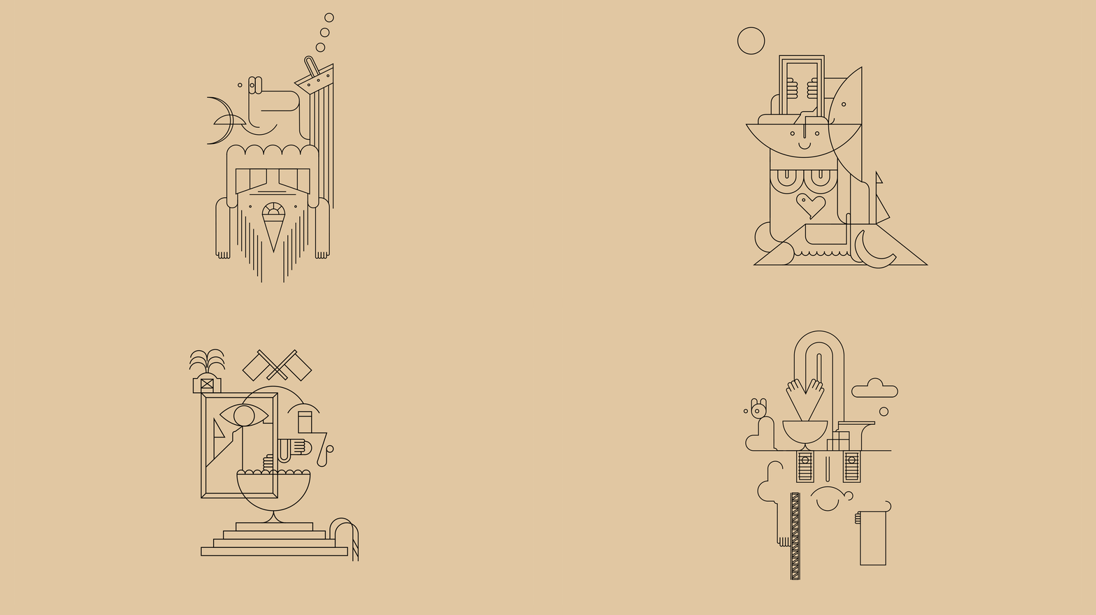
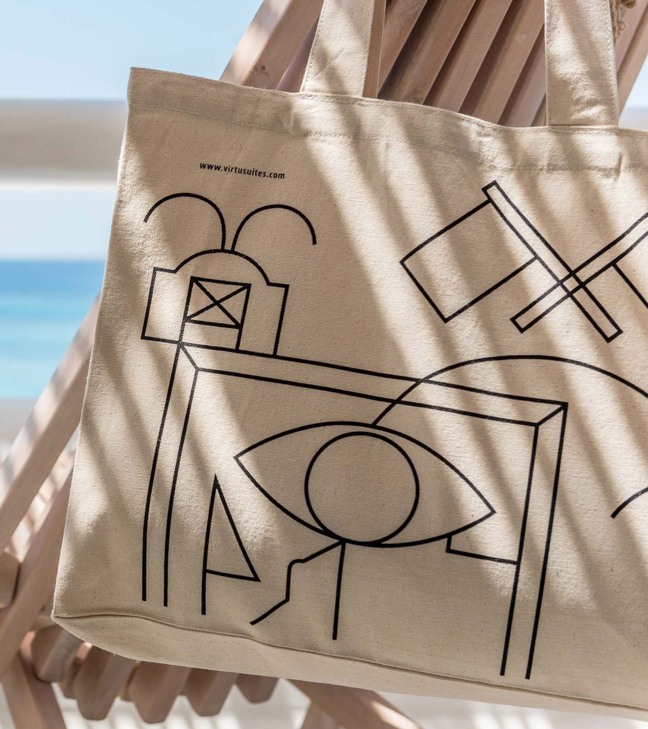
We built a visual identity that is initially invented with a cutting edge and some sleek elegance. The black totally hybrid illustrations that cover the personnel’s equipment combine pure clarity and play. And a hint of the unexpected. Virtù Suites is an authentic style of treasure. An atmospheric space, in-between night and day, adorned with clay, stone, and driftwood elements and flooded by the Mediterranean light. That is why we were dedicated to fusing form and functionality in order to demonstrate a human-centric approach that connects humans, nature, and services. It was crucial for us to create for a brand located in a well-known Cycladic island, to think and act like a real person rather than treating accommodation like a functional service. We told an elegant story, in a spectacular setting.
PHOTOGRAPHY: GIORGOS SFAKIANAKIS

