Saluti Da Stampalia Suites Branding
THE CONTEXT
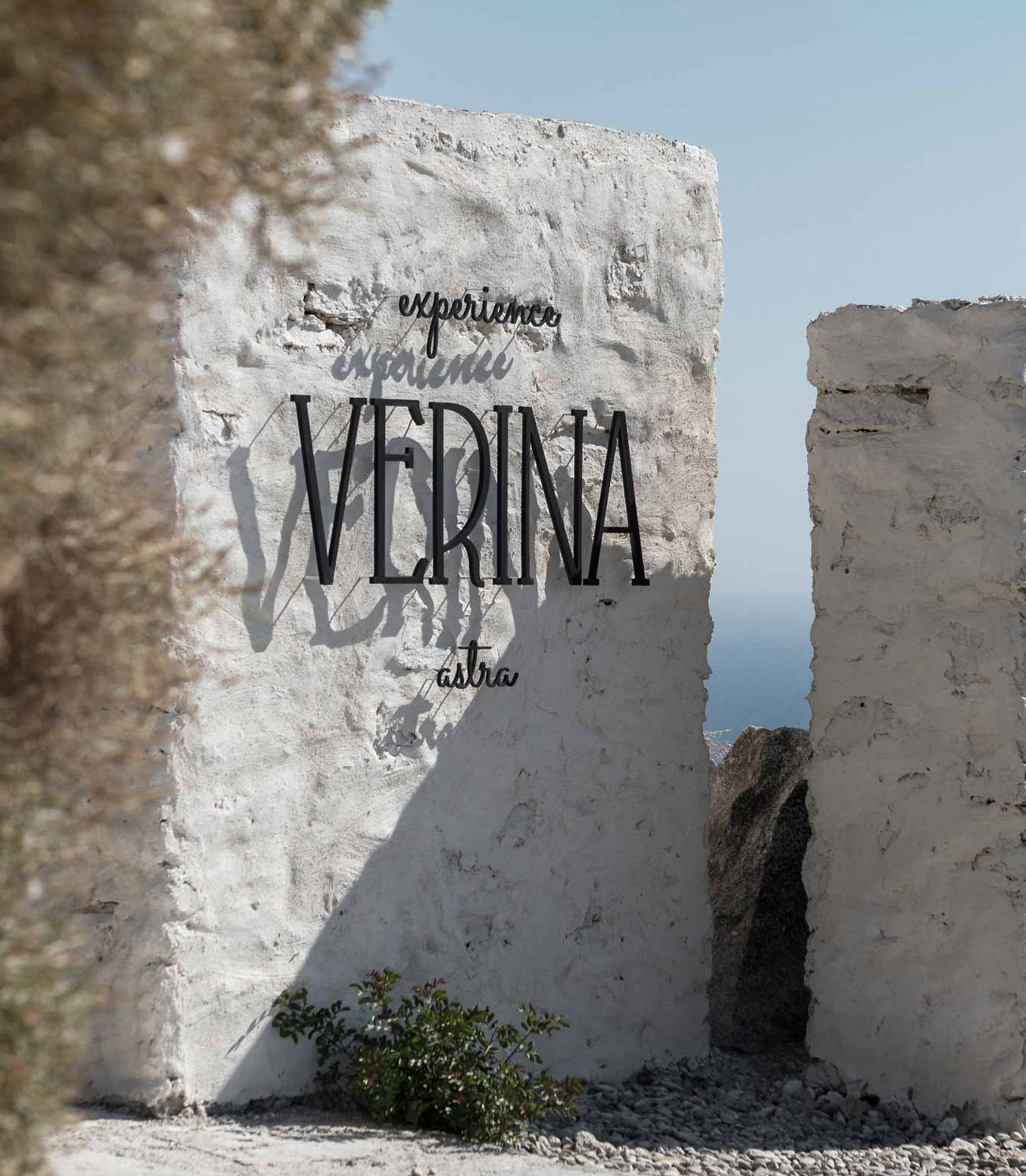
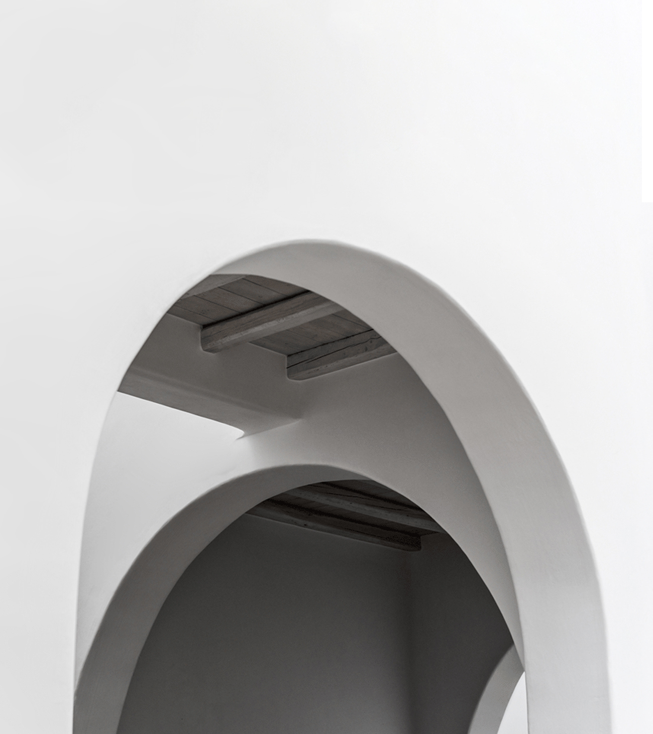
Branding for a hotel should be less concerned with making things look great and more concerned with creating an exceptional experience that a target audience will enjoy. We chose a core story. We found a color and a tone. Blue. A whole world framed by the infinite blue of the Aegean Sea and the intense light which floods this small, pure white land, our beloved island of Astypalaia.


THE CONCEPT
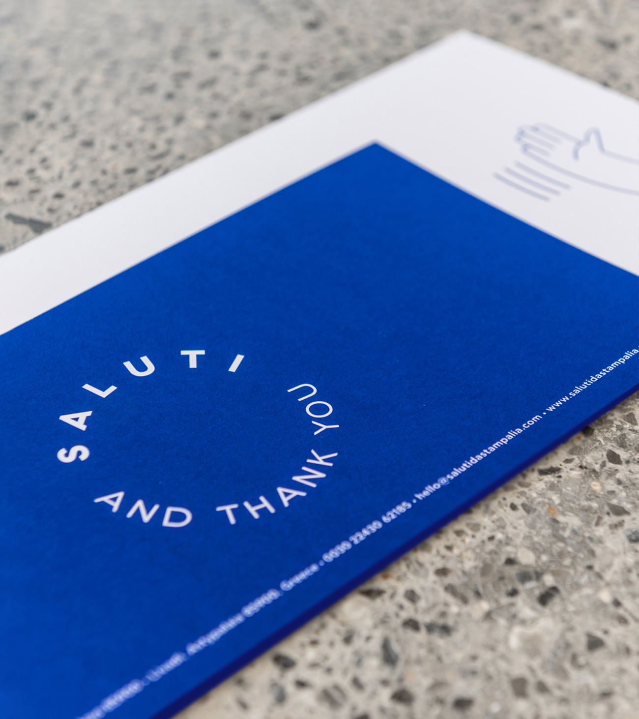
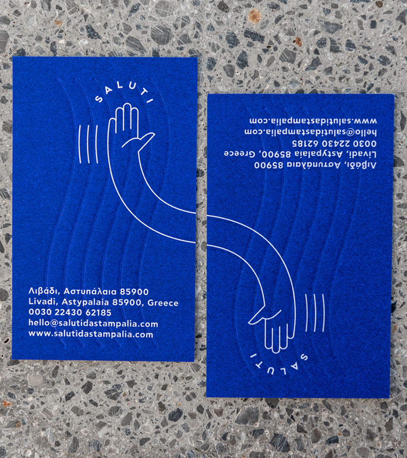
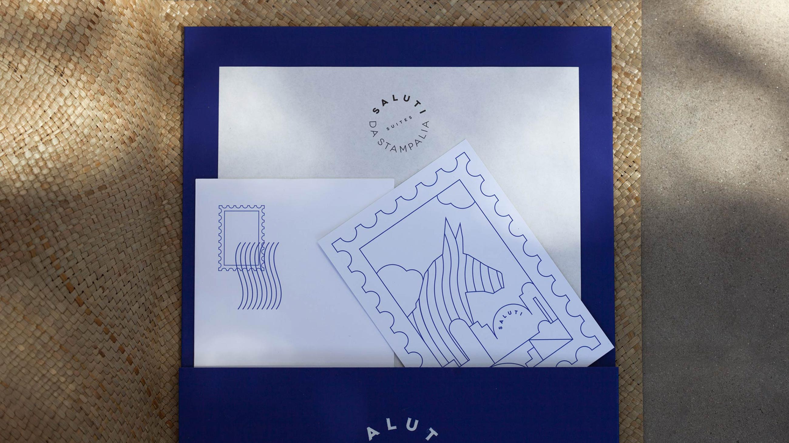
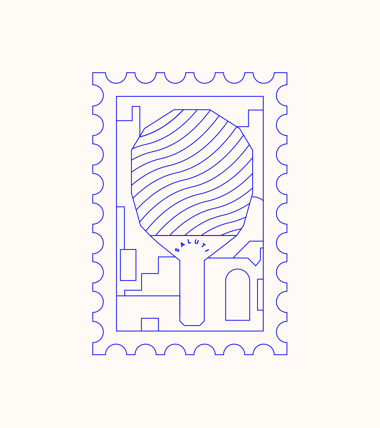
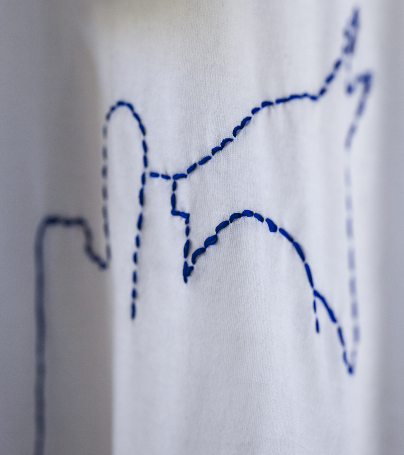
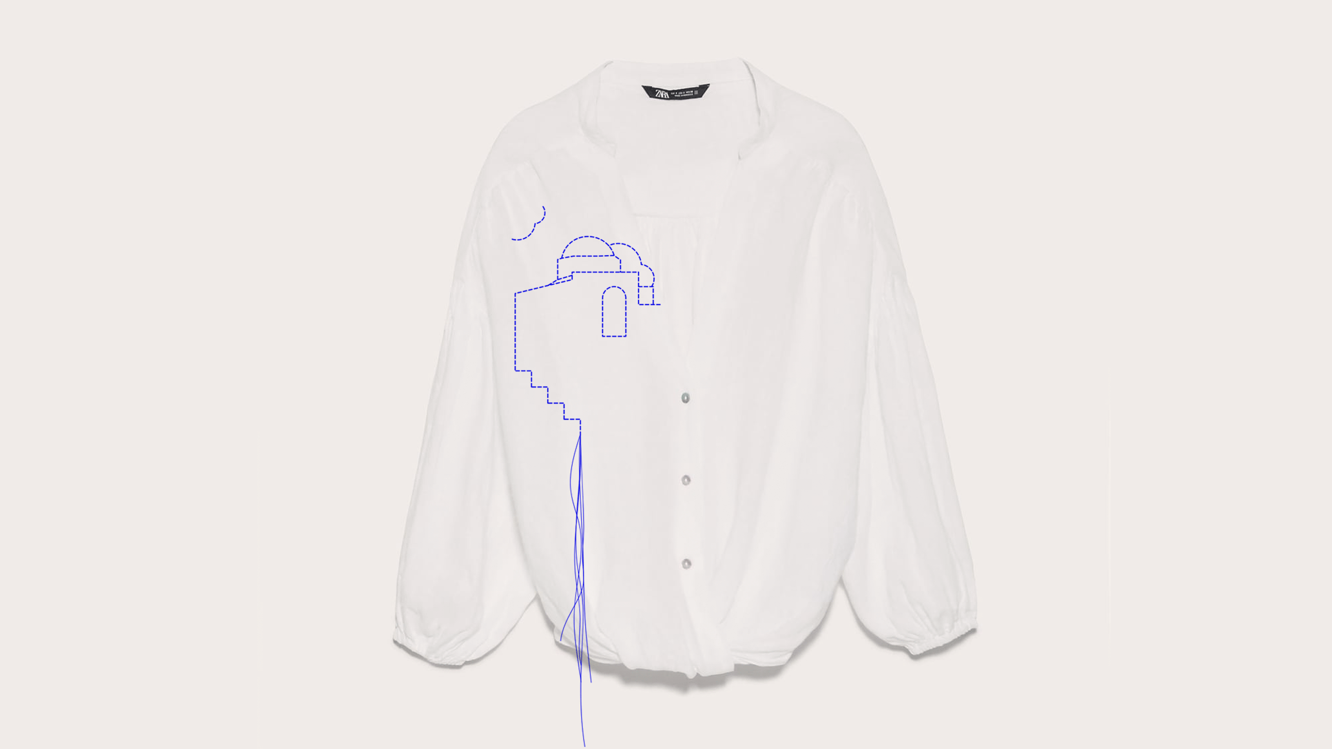
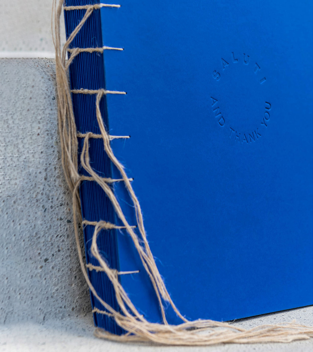
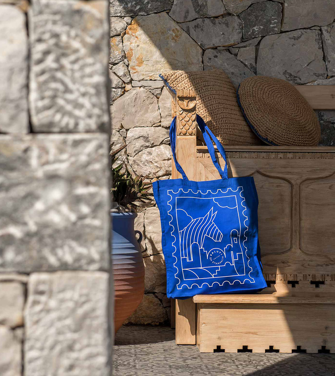
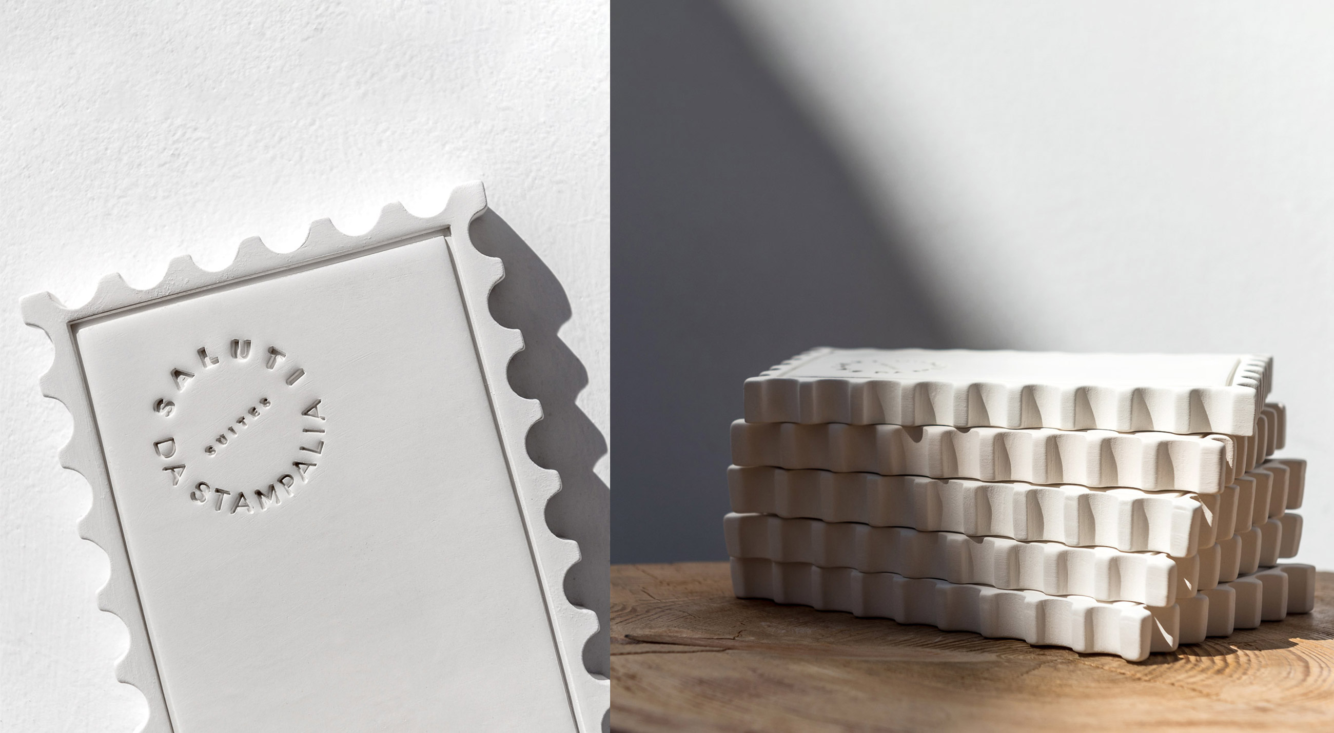
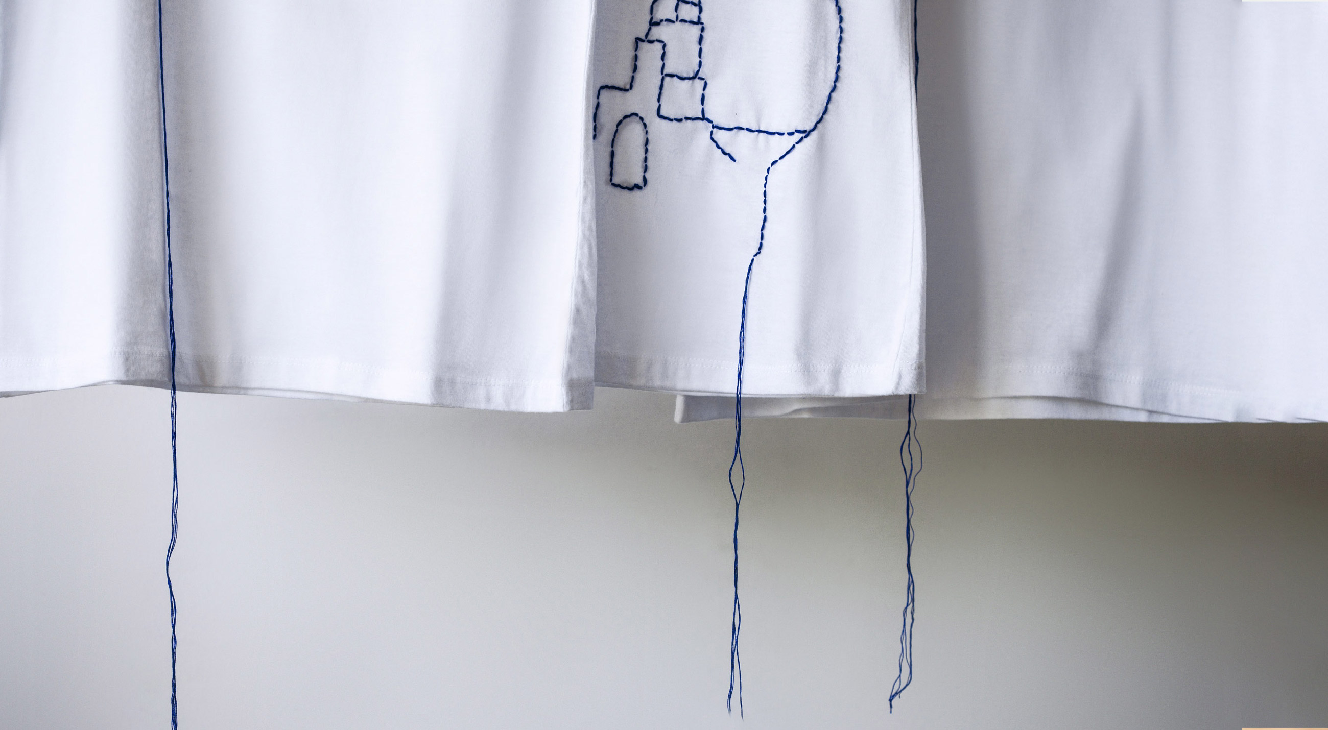
Inspired by the postal paraphernalia —stamps, envelopes & vintage cards postals— of the inhabitants during the Italian occupation of the island, we created a total brand story that is consistent and recognizable. The graphic design is characterized by the use of basic geometric stamp shapes, a clear and simple structure, as well as the generous use of white space. The blue Aegean sky combines perfectly with the blue pen color of the vintage correspondence envelopes. With a sharp focus on details, we illustrated some vital and characteristic elements of the Astypalaia island. A vintage suitcase and a donkey, among others. Distinct design in overall details that combines clarity and play, identifies the hotel’s point of difference.
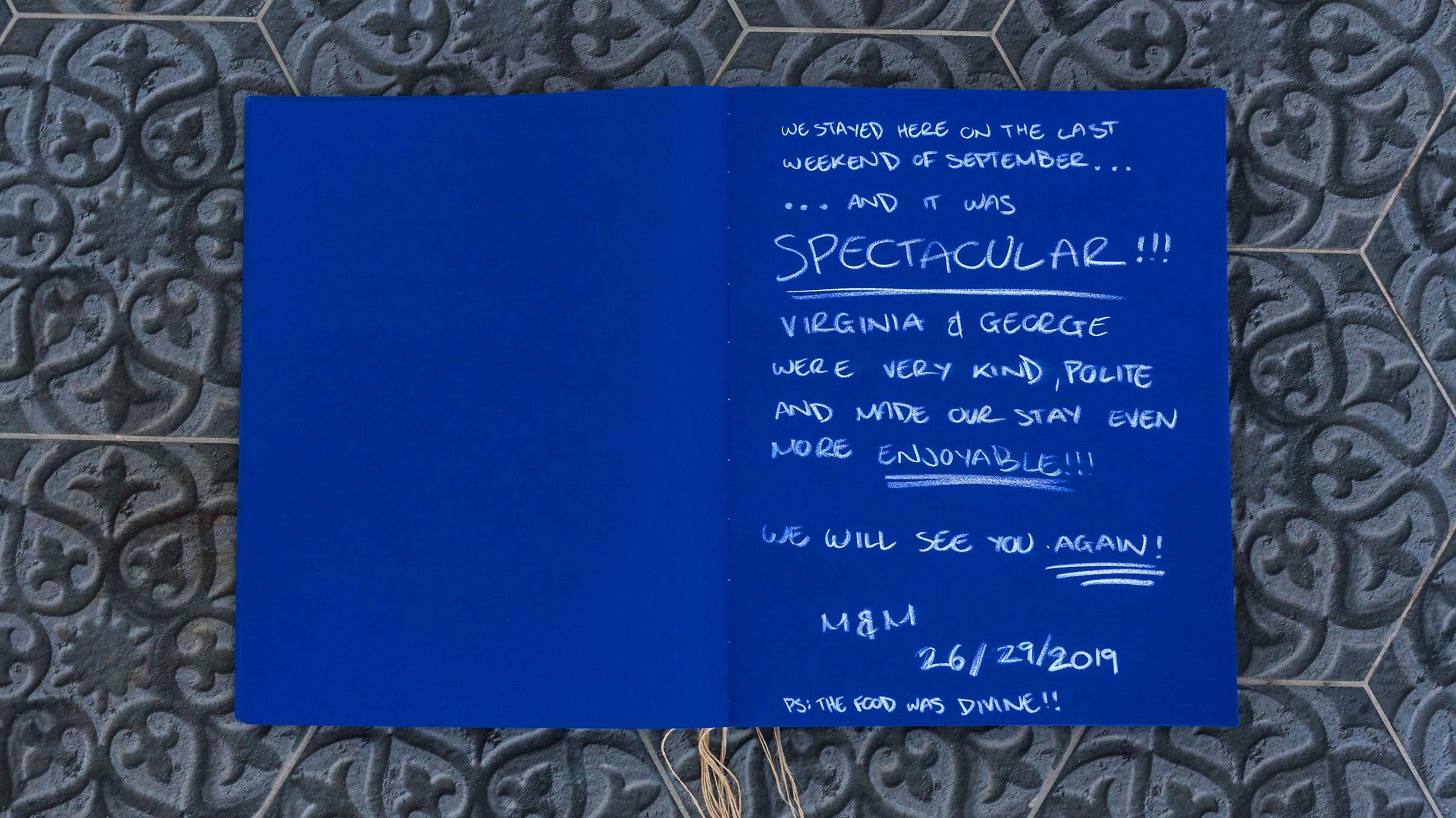
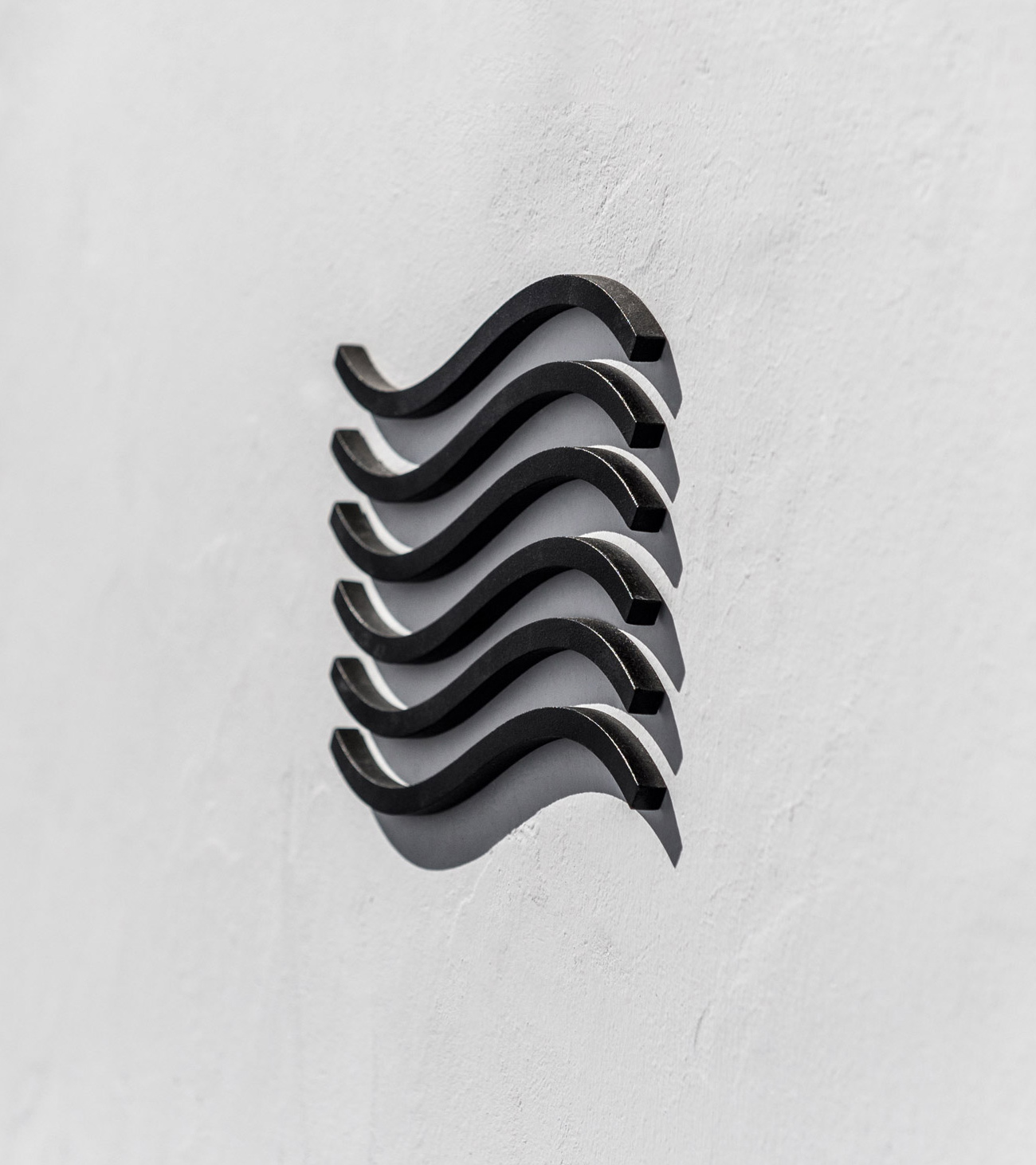
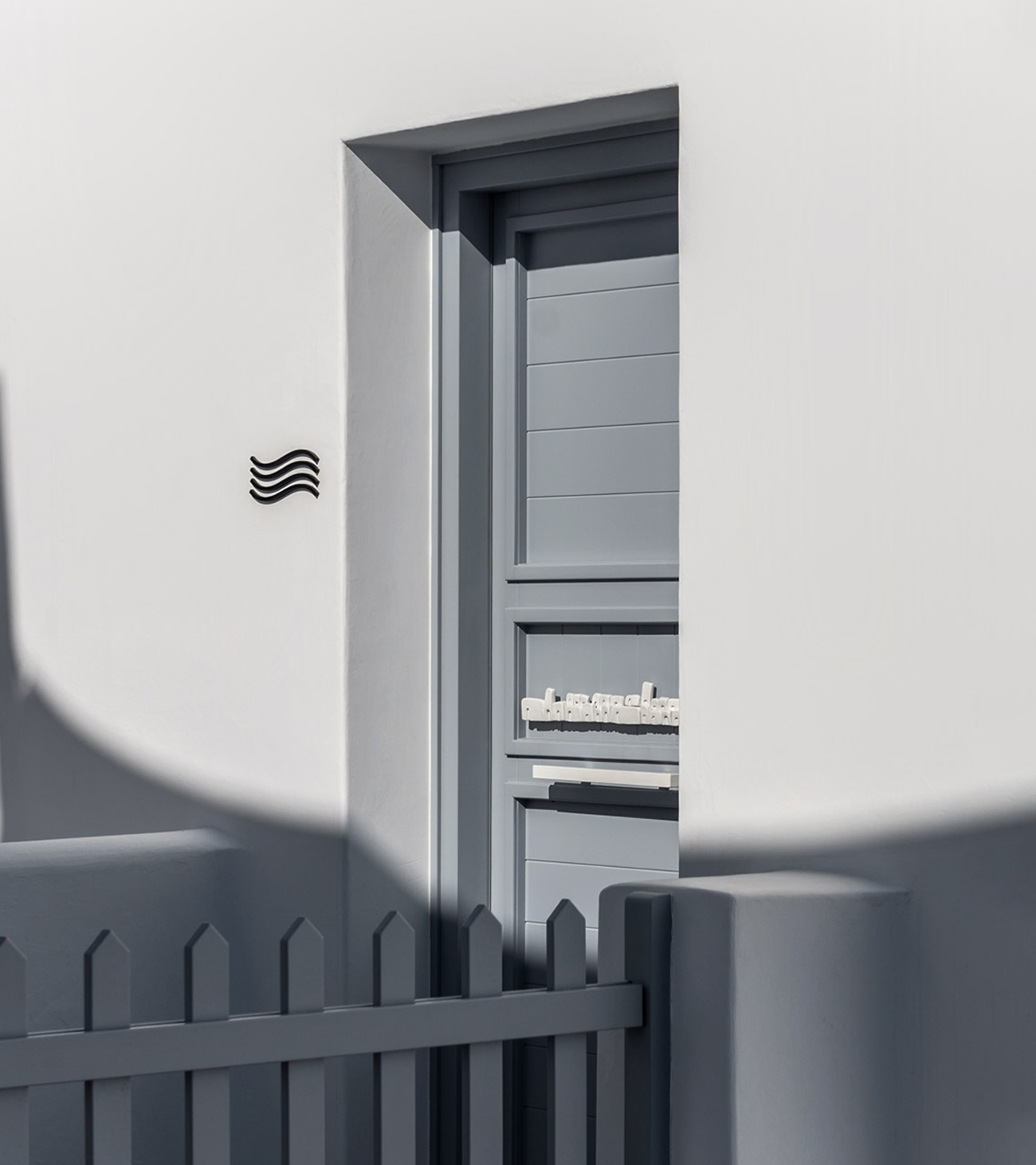
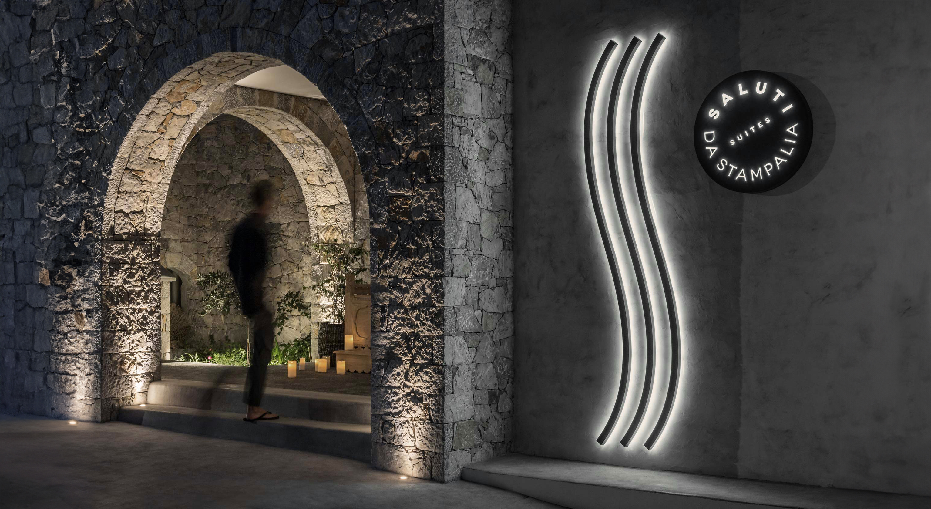
We shared a consistent story that builds loyalty, encourages return visits, and increases profitability. Our core product is the hospitable spirit of its creators. That is why we built our advertising copy, collateral, and print material on that basis. They are friendly, too. We developed the signage of the hotel based on anticorrosive materials: We are next to the sea. Aegean aesthetics which promise a luxurious escape is the overall experience that Saluti wants to be defined.
Saluti Astypalaia!
PHOTOGRAPHY: GIORGOS SFAKIANAKIS