JackieO’ Mykonos
THE CONTEXT
When it came to the JackieO’, we didn’t want to create another rebranding attempt that needed explaining and demystifying. JackieO’ is iconic in everything.
THE CONCEPT
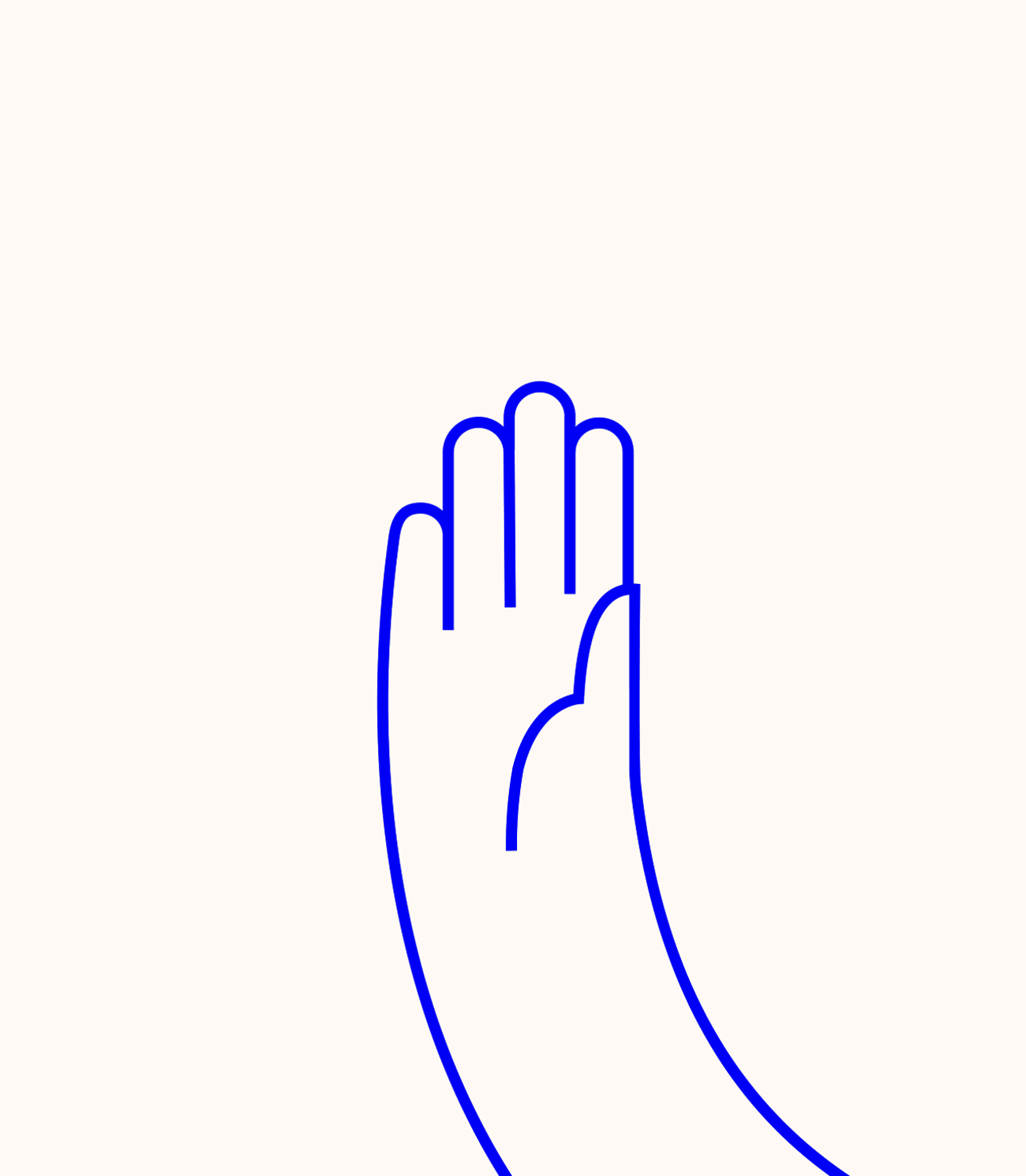
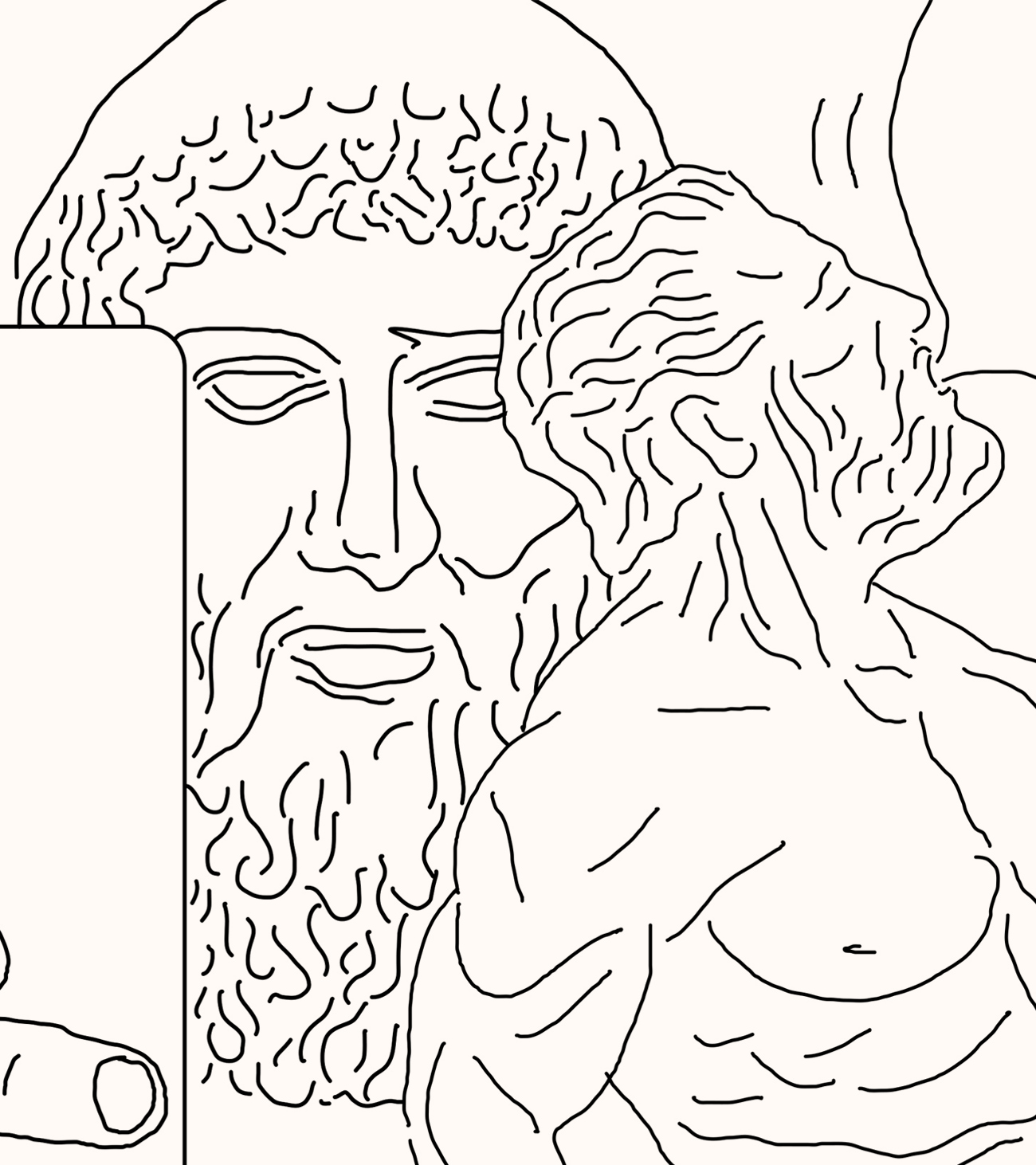
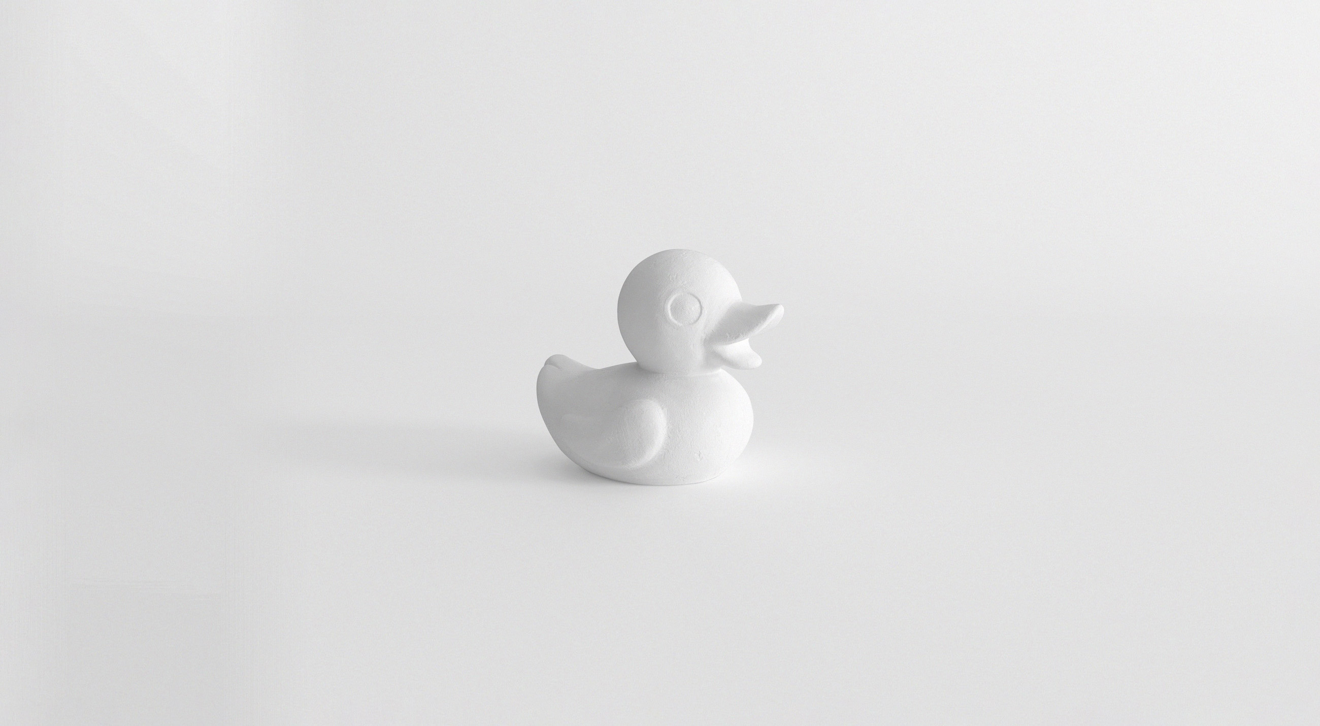
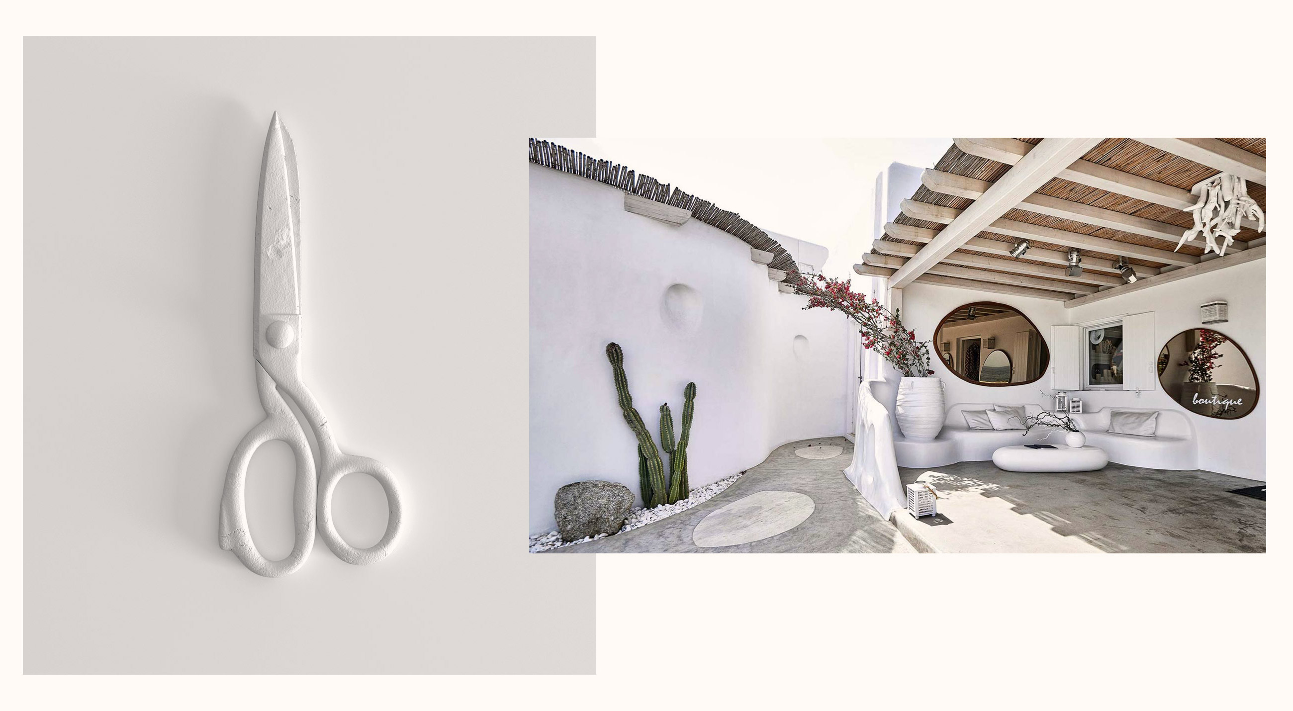
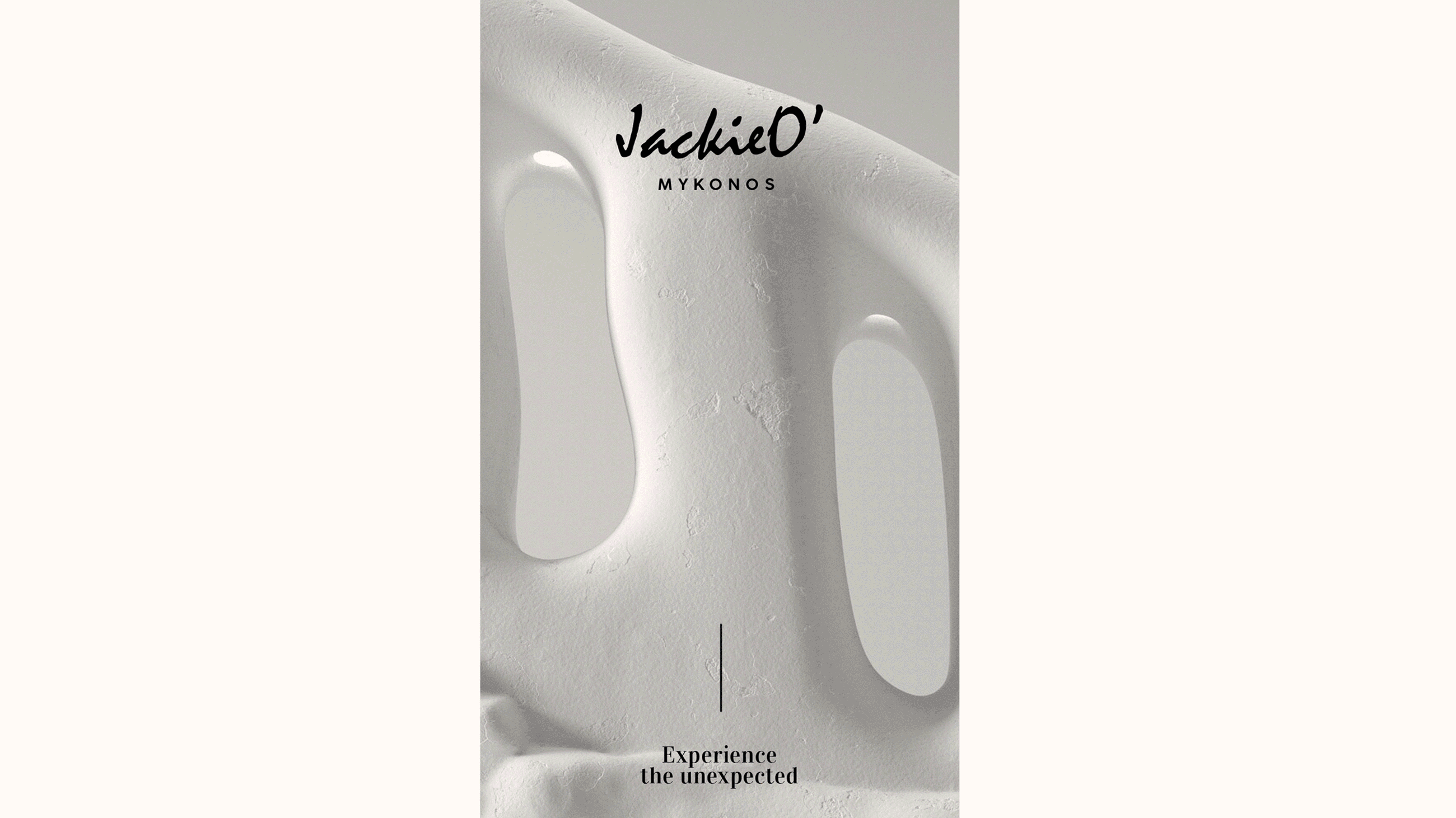
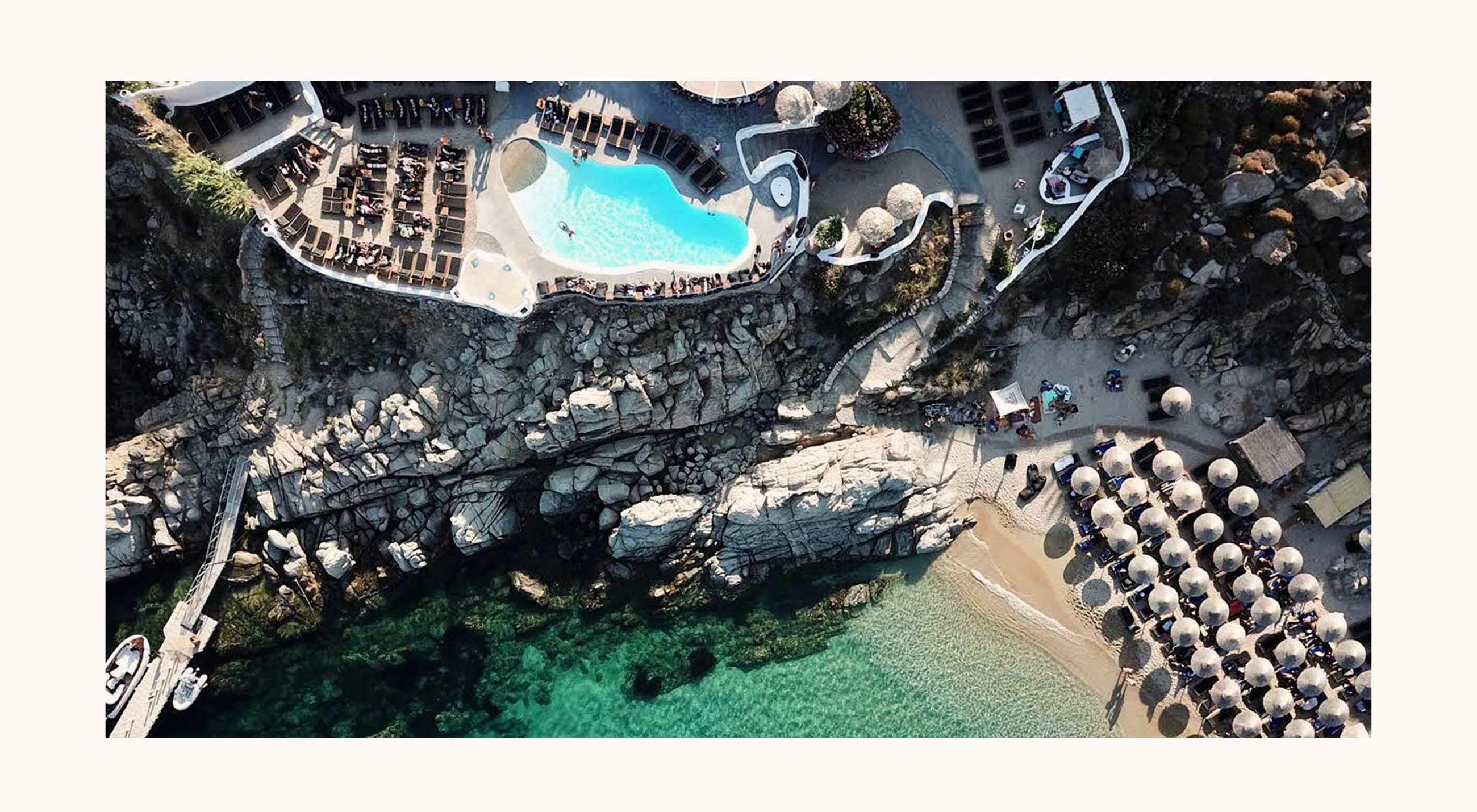
Mykonos is an iconic island, hiding a worldwide reputation, too. We were appointed to bring the entire visual brand identity in line —the typically JackieO’ audience and clientele— with its new strategy and creative vision. Using a strong stylish black & white baroque style font and intensifying the white on white aesthetics on spaces and surfaces, we wanted to renew. Reimagining the plasticity of the bright white walls, we created totally unexpected 3D modeling objects —as ornaments than embrace a strong visual language— in order to establish the new online categories. We strongly believe that people will be engaged again. New visitors will be welcomed.

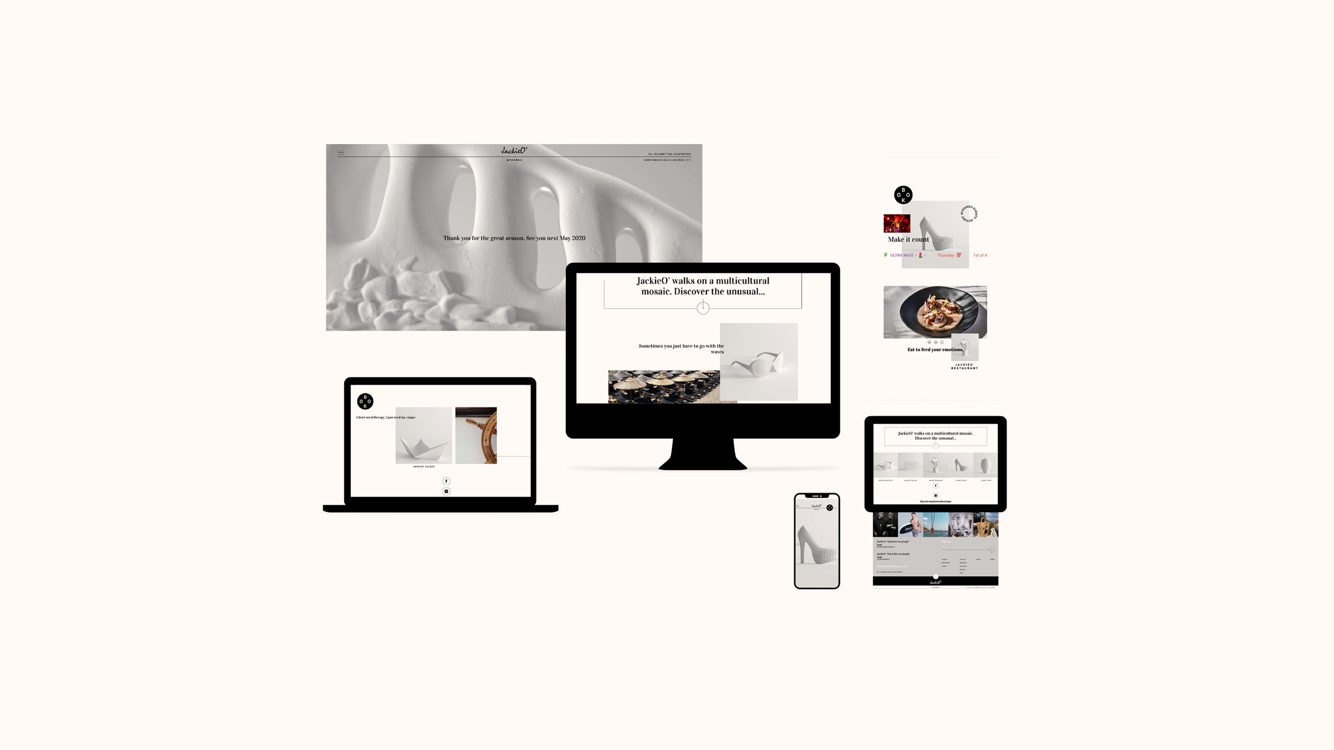
We created a friendliest web place, showing the well-hidden aspect of the location. Although stylish, but even more dynamic and highly effective according to reservations’ priority. This is a more compelling lifestyle choice and not just an alternative one. The identity adopted a slightly disruptive propaganda-style aesthetic — something that allowed clear standout and contrast to the already JackieO’ established and premium aesthetic, so far. So, experience the unexpected. From now on, JackieO’ walks on a multicultural mosaic. Discover the unusual.

POST PRODUCTION IMAGES: BEZIER ANIMATION STUDIO